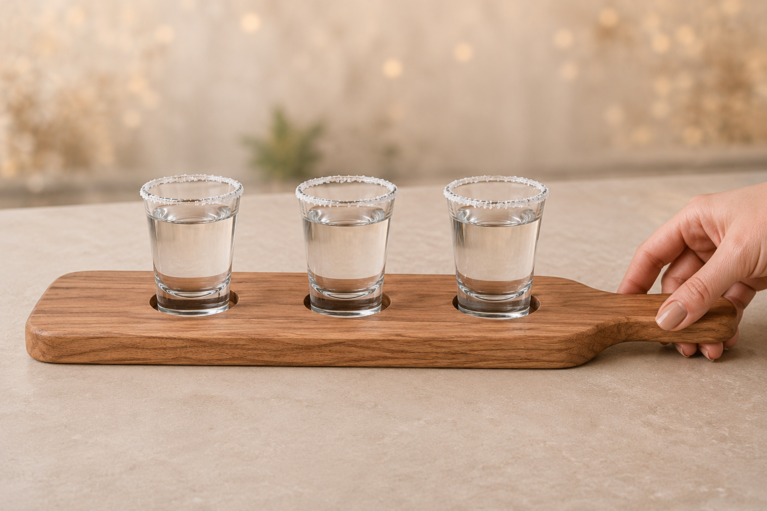
Engraved wooden boards have become a very popular product for gift shops, promotional companies, and brands looking to offer distinctive merchandise. Whether sold as retail items or used as customized promotional products, the engraving style can greatly influence the final appearance of a wooden board.
Choosing the right font is not only a design decision. When engraving on wood, factors such as wood type, grain pattern, contrast, and font thickness directly affect how clearly the final design will appear. Understanding how these elements interact helps ensure that the engraving is readable, professional, and visually balanced.
Unlike printing, laser engraving burns the design directly into the surface of the wood. Because of this process, very thin lines or overly delicate fonts may not engrave as clearly as expected. The engraving depth, wood grain, and natural color variations can all affect the visibility of text or logos.
Fonts that look good on a screen do not always perform the same when engraved on wood. Very thin strokes may disappear in darker grain areas, while overly decorative fonts can lose definition during the engraving process.
For most custom boards, the goal is to create a design that is:
• Clear and easy to read
• Visually balanced with the size and shape of the board
• Compatible with the wood species
• Durable and recognizable over time
Choosing the right font helps ensure that the engraving maintains clarity and a professional appearance.
Although the type of wood affects the final engraving result, choosing the right font style is also essential for achieving a clear and professional design. Some font categories work particularly well on wooden boards because they maintain good readability during the engraving process.
Script Fonts
Script fonts imitate handwriting or calligraphy, with letters that often flow and connect together. This style creates an elegant and personal appearance, making it very popular for customized products such as wedding boards, anniversary gifts, or personalized presents.
Examples: Great Vibes, Allura, Pacifico, Dancing Script
Serif Fonts
Serif fonts include small decorative strokes, known as “serifs,” at the ends of letters. This style conveys a classic and sophisticated appearance, which is why it is commonly used in traditional branding or refined designs.
Examples: Times New Roman, Garamond, Playfair Display, Baskerville
When engraved on wood, medium-weight serif fonts typically provide a good balance between style and readability.
Sans-Serif Fonts
Sans-serif fonts do not include decorative strokes at the ends of letters, giving them a clean and modern appearance. They are widely used in corporate logos and promotional products because they maintain readability even when engraved at smaller sizes.
Examples: Helvetica, Montserrat, Futura, Open Sans
Thanks to their simple and well-defined shapes, sans-serif fonts are often one of the most reliable choices for laser engraving.
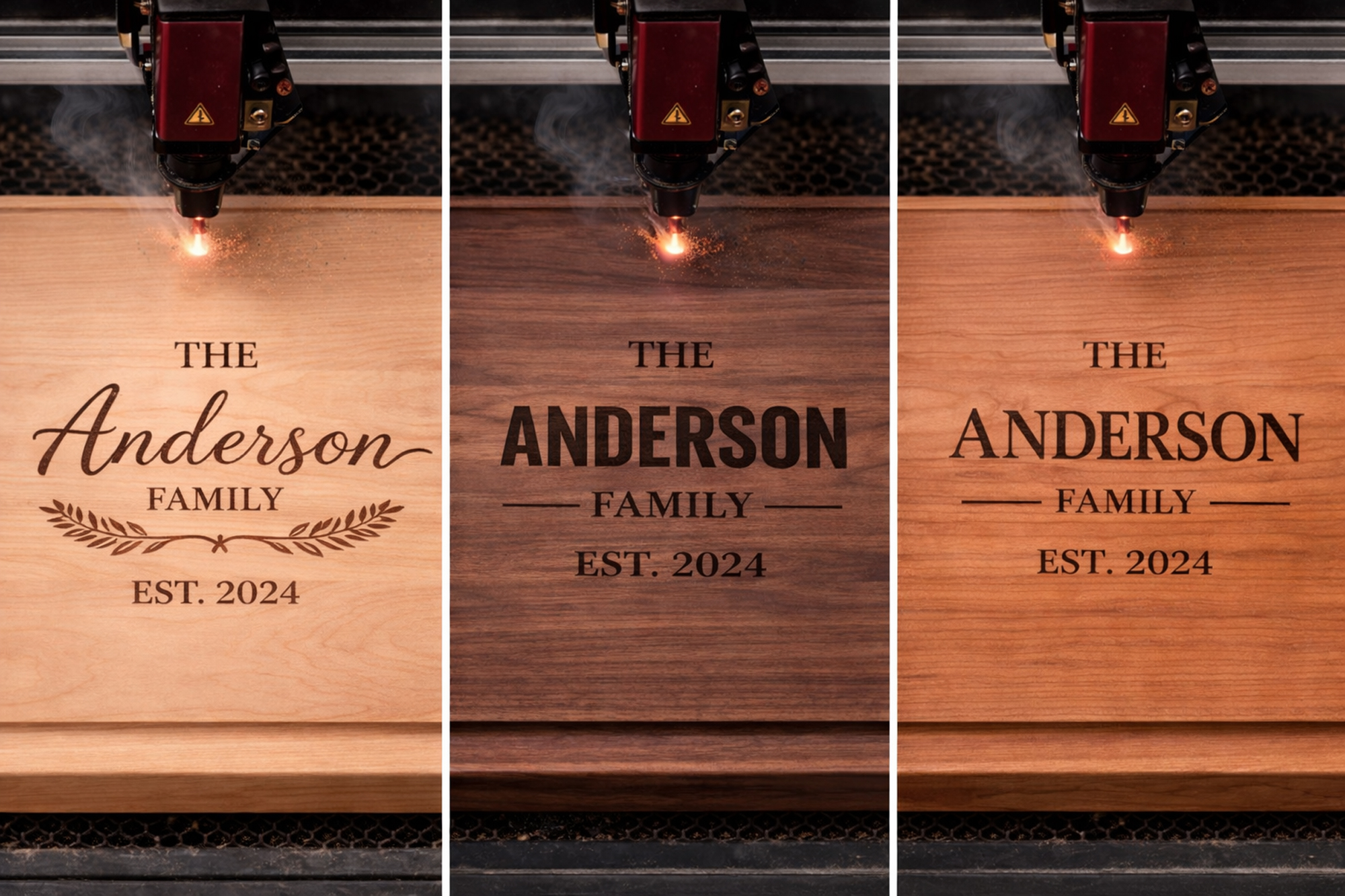
Each wood species reacts differently to laser engraving. Factors such as color contrast, hardness, and grain pattern directly influence how visible the engraving will be.
Maple: Ideal for Detailed Engraving
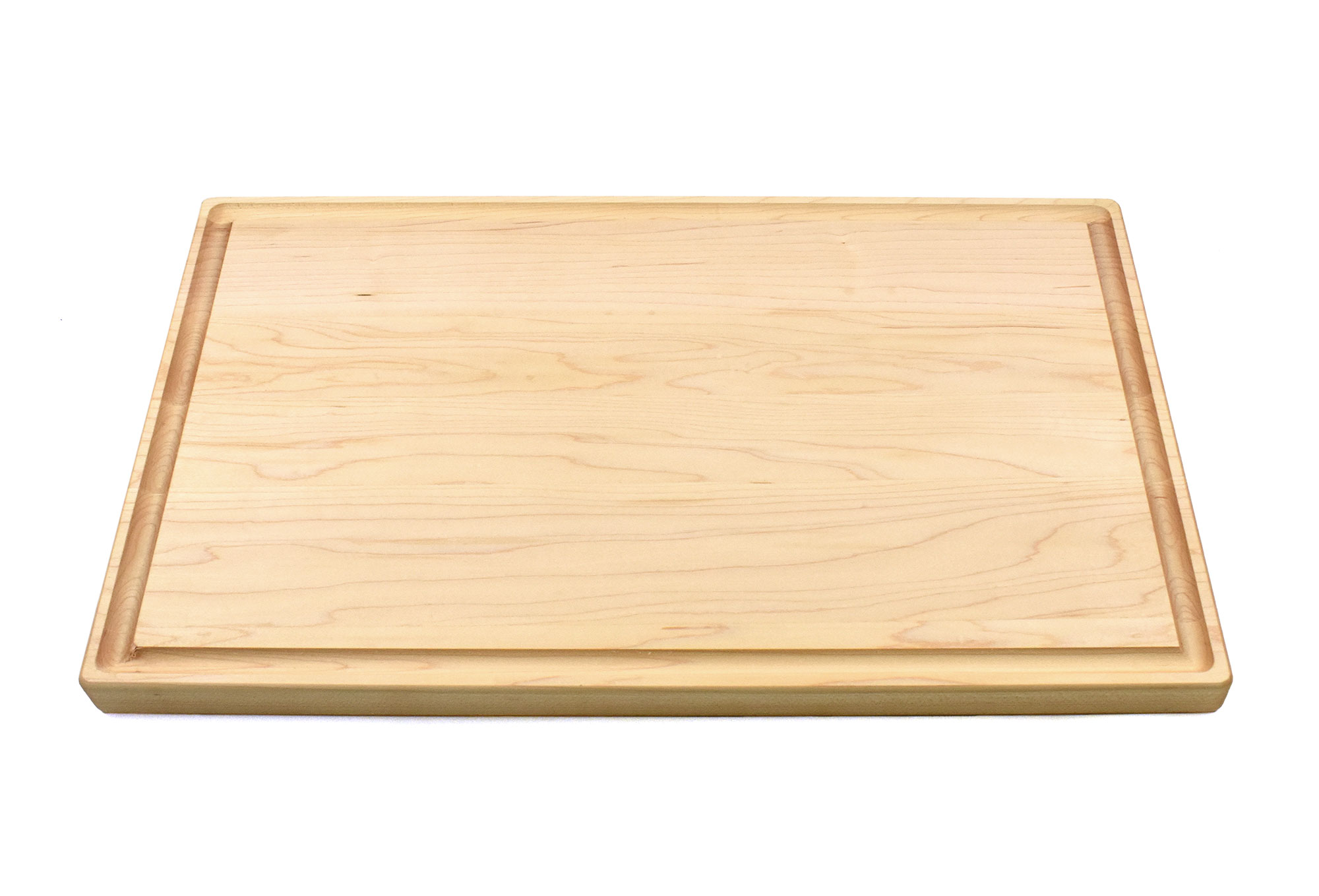
Maple is one of the most popular woods for engraved cutting boards. Its light color and fine grain create excellent contrast when engraved, allowing designs to stand out clearly.
Because of this consistency, maple works well with:
• Script fonts
• Decorative designs
• Logos with finer details
• Smaller text sizes
Gift shops often prefer maple boards for personalized products because they allow detailed engravings without losing readability.
Walnut: Why Thicker Fonts Work Better
Walnut boards have a deep, rich tone that gives them a premium appearance. However, the darker color means the engraving contrast can be more subtle compared to lighter woods.
For this reason, thicker and simpler fonts tend to work better on walnut boards.
Recommended engraving characteristics for walnut include:
• Thicker lettering
• Clean sans-serif fonts
• Minimal decorative elements
• Slightly wider spacing between letters
Very thin or overly decorative fonts can become difficult to read against walnut’s darker surface. Using a clear and robust font helps keep the engraving visible and professional.
Cherry: Balanced Contrast for Engraving
Cherry wood has a warm tone that sits between maple and walnut in terms of engraving contrast. Its grain is usually smooth, which allows good readability across different font styles.
Cherry boards often work well with:
• Classic serif fonts
• Medium-weight lettering
• More traditional branding designs
Over time, cherry naturally darkens slightly, which can give engraved designs an even richer and more elegant appearance.
The final use of the board should influence the engraving style.
For gift shops, decorative and personalized fonts often work best. Customers are usually attracted to designs that feel unique or sentimental. Script fonts, handwritten styles, and elegant serif fonts are commonly used for these types of products.
For corporate branding or promotional products, simplicity and clarity are more important. Businesses often prefer bold logos and clean fonts that clearly reflect their brand identity.
An effective engraving for branding should:
• Be easy to read
• Reproduce consistently across different wood types
• Maintain a professional appearance
For this reason, many promotional boards use simple fonts and balanced logo designs.
Achieving a professional engraving result often depends on keeping the design simple and balanced.
Some useful recommendations include:
• Avoid extremely thin fonts
• Leave enough spacing between letters
• Keep logos simple and uncluttered
• Adjust the font thickness according to the wood type
In many cases, simple designs produce the best engraving results. Overly complex fonts can lose definition, especially on darker woods or boards with stronger grain patterns.
For gift shops, promotional companies, and branding projects, the best approach is to choose fonts that are clear, balanced, and compatible with the natural characteristics of the wood.
By understanding how font style, wood type, and the engraving process work together, it becomes possible to create custom boards that look professional, readable, and visually appealing.